|
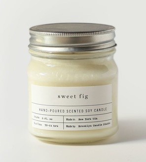
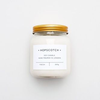
This week's design challenge requires the design and creative process behind creating a soy-based candle with plaid patterns. My job as the designer is to hone in on the color, texture and form to best convey this product. Therefore, one of the most crucial elements of a candle and the first thing I look for is what it smells like. Because the overriding graphical motif is plaid, a cozy and warm sensation is already insinuated. I decided that wintery smells would be the most cohesive and understandable scent to go with these candles. Some candle design inspiration was pulled from the following photos.
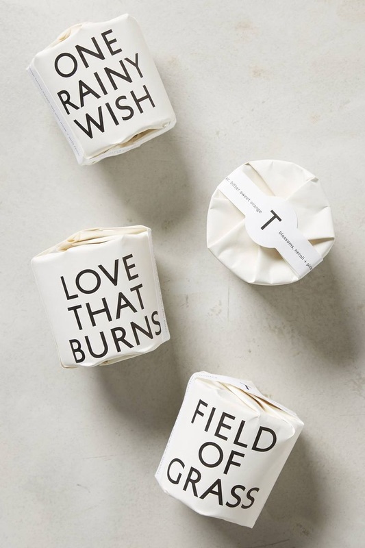 The problem with plaid is that it is often times very colorful and bold. However, I want to ensure that the plaid patterns don't overwhelm the simplistic and beautiful design of the candle itself. Therefore, similar to the design from the candles above, I feel that the best way to go about the plaid design would be to have it on the outside wrapping. That way, once the candle is opened, it is not too bold and doesn't scream CHRISTMAS when people are still burning it in the spring and summer months.
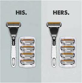
The main elements and the design process behind these plaid, soy candles would be: Brand Name: MELT Cover Packaging: Monochromatic plaid (white, cream, soft gray, beige) Similar to the inspirations above, the identity and design of the candles would be minimalistic and sophisticated so that users are able to leave it out and burn it year-round. When it comes to shaving cream, it is often very gender segregated with women having perfumed and fruity shaving cream displayed in pink, flowery canisters and men have bold, darker colored and "masculine" designed aerosol spray cans. An easy way, therefore, to create a more gender neutral shaving cream packaging is through the color, smell, and overall design. Some inspiration for this "He Shaves, She Shaves" challenge can be found below.
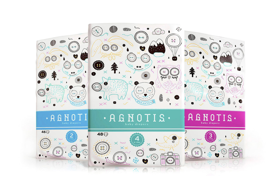
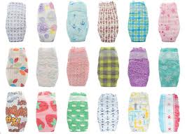
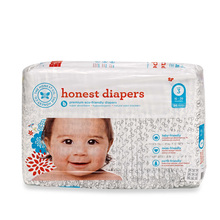
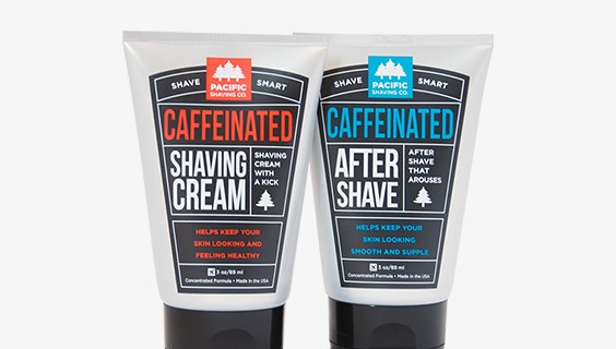 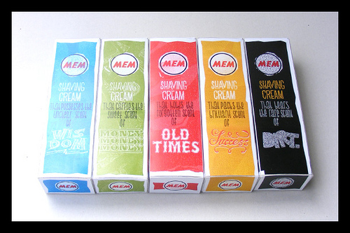 By using gender neutral coloring as well neutral font choices, my final package design included an outside box and then the tube of shaving cream on the inside. 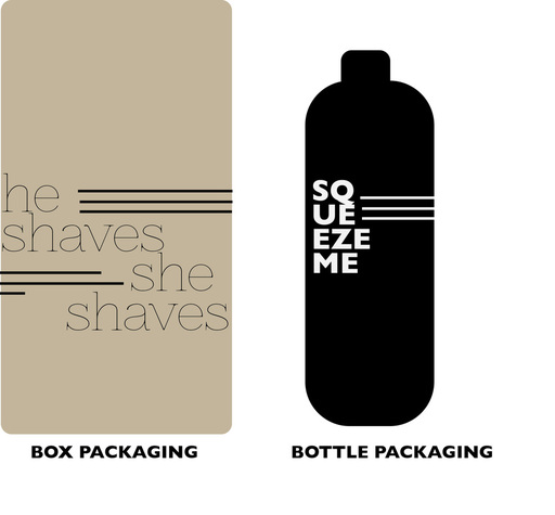 I've always wondered why diaper packaging has to be so unpleasing to the eye. When it comes to diapers, companies always feel the need to plaster a babies face across the entire front of it. However, this seems incredibly unnecessary, everyone knows diapers are for babies. Therefore, I have done some research for mediocre to somewhat decent diaper package design, but ultimately drew my inspiration for my own design from a minimalist and trendy standpoint.
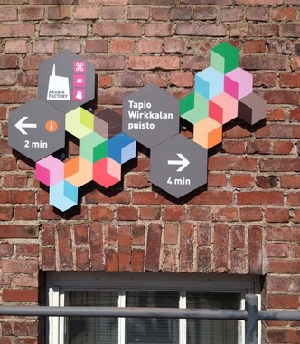
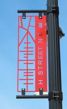
 People often need diaper bags to carry diapers, wipes, toys, bottles, etc. Therefore, by saving parents money and creating a simplistic and reusable diaper bag packaging, there can be more uses than just one for the product they are buying. Just to get an overall concept/idea over the product, the design of the bag is a backpack. Sticking to monochromatic color schemes allows for the bag to transported and used anywhere. Babes Diapers appeals to the modern-day, trendy, city dwellers. Nobody needs to see the sizes of what diaper your child is wearing. Therefore, by placing the size on the back of the bag, moms and dads know exactly where to look without it being overly apparent for the general public. A black plastic zipper would be arranged at the top of the bag near the handle, with convenient straps for the option to travel with it and bring it anywhere the baby goes. Much like the material of a reusable tote bag, this packaging wouldn't be very expensive. 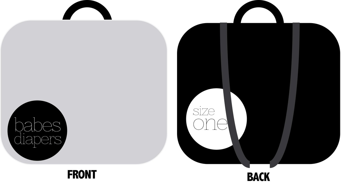 Like we so often discuss in class, an example of everyday packing is Trader Joes. It is a unique example of good design because of it's originality. While most grocery stores often display generic or mainstream packaging, Trader Joes takes the extra step to make their products look visually captivating. A few examples of this are: 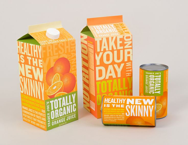 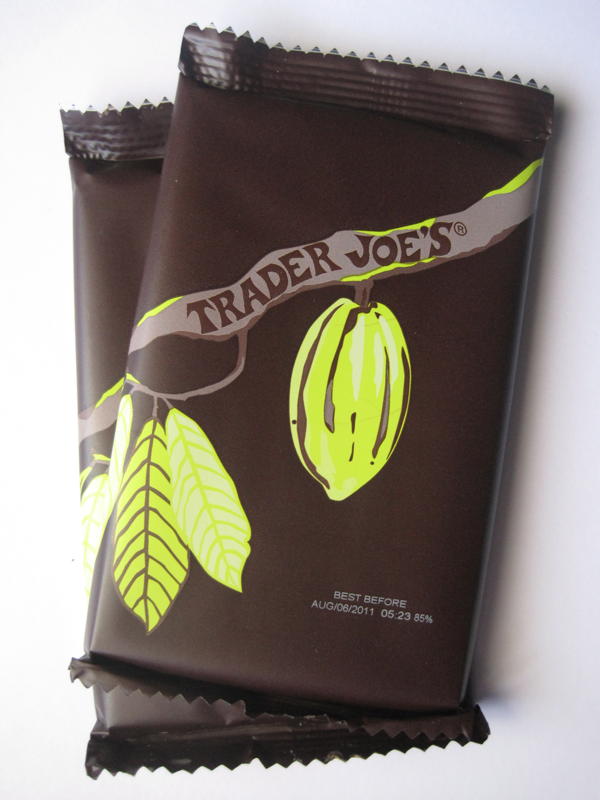 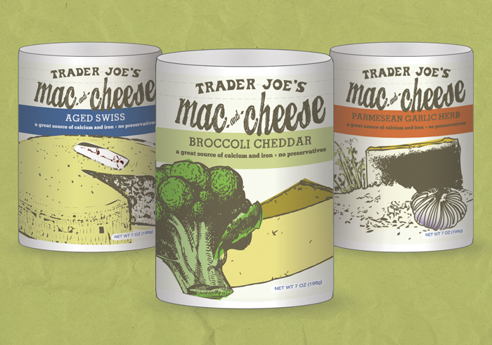 Another example of good design packaging can often be seen at coffee shops. Examples of these types of packaging can be found below. 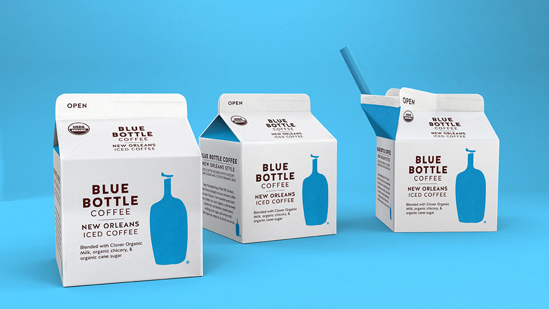 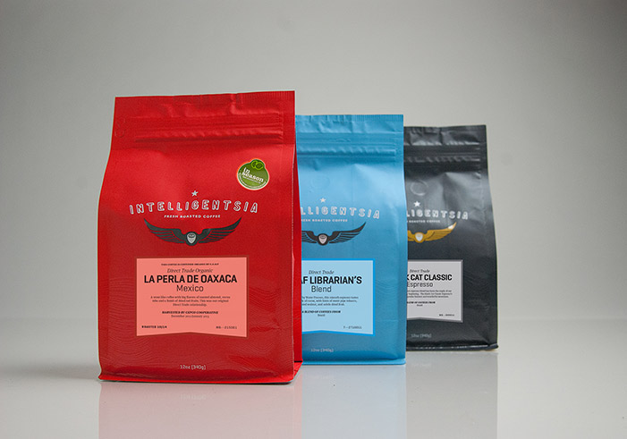 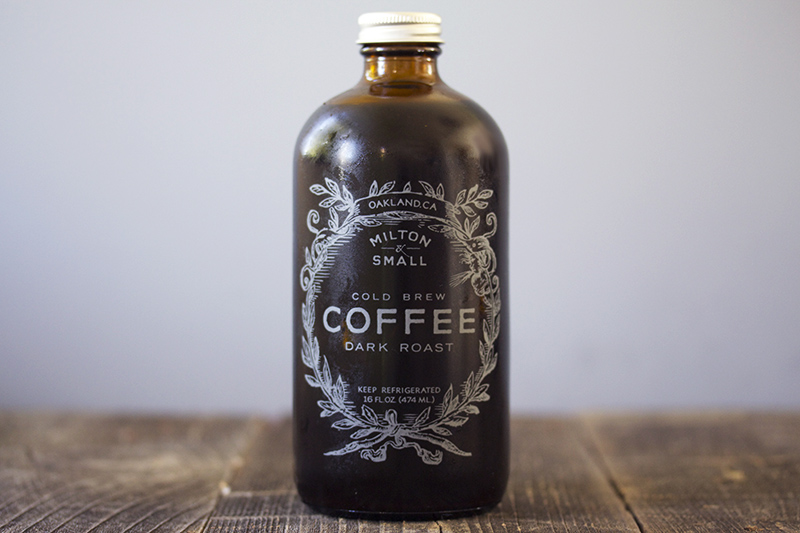  Inspiration/Research behind all things blue:    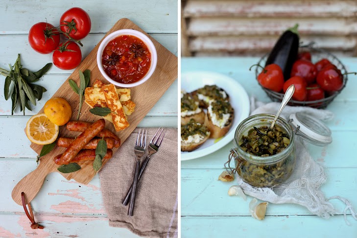 From looking at these images, I decided to create "Blue, A Comfort Food Magazine". This plays off both the aesthetics of the color blue but also includes the idea behind a "blue" mood. Anything from pasta and dessert recipes to new and upcoming restaurants or food trends, this magazine could have an array of articles in it. The first rough attempt at a cover: 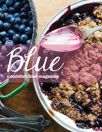 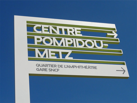 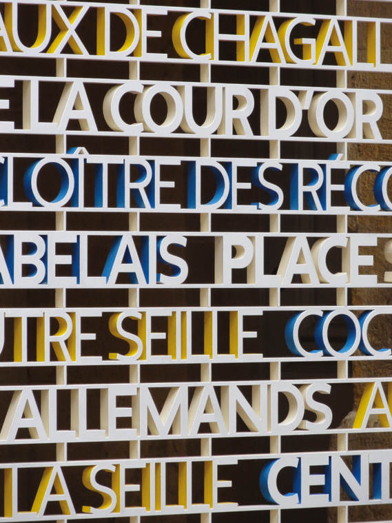 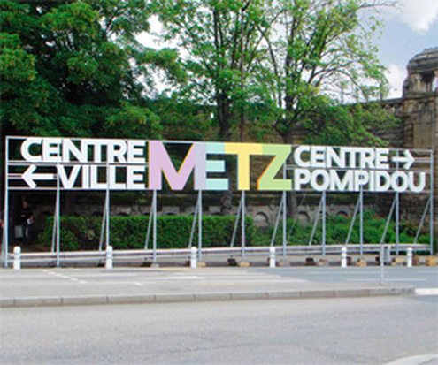 The examples above are all clean and streamline signage that gives enough context into what is nearby but is also very aesthetically pleasing. I especially like the first sign, where they use simple arrow design and see through letters for their sign. The best way for this to be executed would definitely be the simpler the design, the better. Most signs go wrong when they begin to have too many concepts, colors and words on their signs. Therefore, the information needed to create the most effective sign would be to have an arrow in the general direction the landmark is, as well as the name. However, to graphically take it another step, even just using logos or symbols would simplify the sign even more and create an aesthetically pleasing look. Examples of signs that look pleasing and artistic to the eye similar to the concept I am trying to convey can be seen in these:
The first song to play when I turned the radio on was The Hills by The Weeknd. In determining how to design the vinyl LP cover for this, I thought it was only appropriate to research their past album covers to see the design choices they make for themselves and then from there see how I would add my own design style to it. 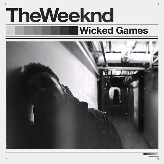 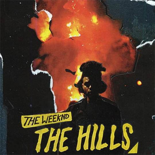 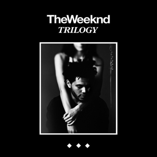 Some further inspiration for this LP vinyl cover included: 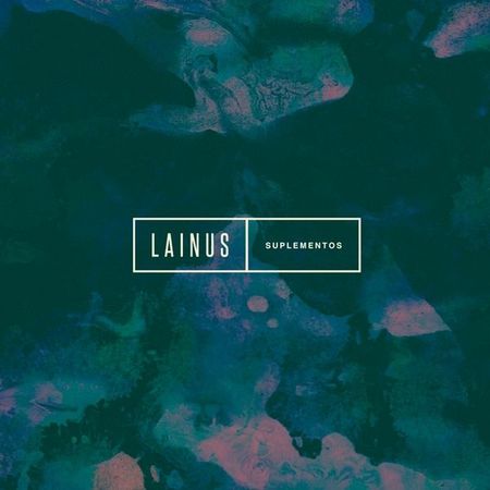    I believe artists should stay consistent with their overall style concepts, even if it is for different songs or albums. Therefore, one common element that The Weeknd has with most of its covers are black and white themes. Also, the presence of photography is very powerful and eye-catching. 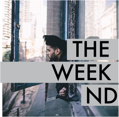 One thing that The Weeknd is popularly known for is his hair. Therefore, I wanted to somehow incorporate his trademark look into the vinyl cover. For the first one, I decided to go with a more straight-forward representation of The Weeknd including both the artist himself (and his hair) as well as the black/white/gray themes he has on his previous covers also. 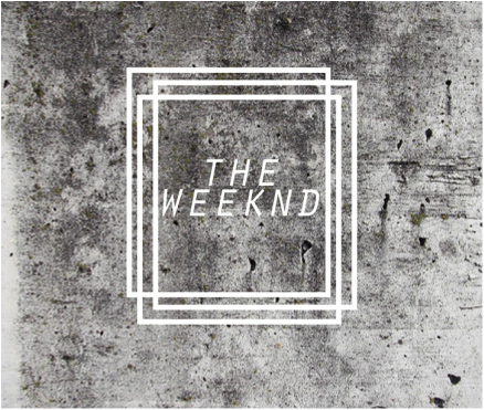 This is a second design that I wanted to play around with for this cover. I think abstract is something that often draws the consumer eye because it is different and unique compared to the usual and expected artist photo. Therefore, I drew inspiration from the Lainus vinyl cover and decided to frame 'The Weeknd' with geometric box shapes in contrast to a highly complex and detailed background. |
Hello!Ashley Evans is a junior journalism student with a minor in graphic design at Azusa Pacific University. When she isn't writing or designing, you can find her drawing, going to concerts or visiting art museums. Archives
November 2015
Categories |


 RSS Feed
