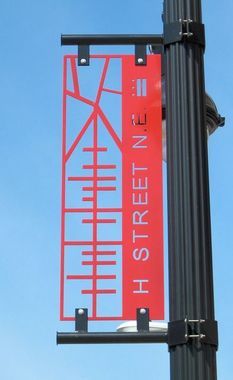
The examples above are all clean and streamline signage that gives enough context into what is nearby but is also very aesthetically pleasing. I especially like the first sign, where they use simple arrow design and see through letters for their sign. The best way for this to be executed would definitely be the simpler the design, the better. Most signs go wrong when they begin to have too many concepts, colors and words on their signs.
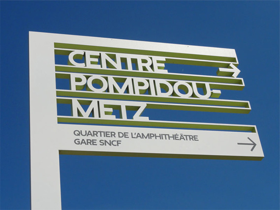
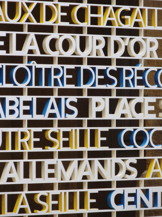
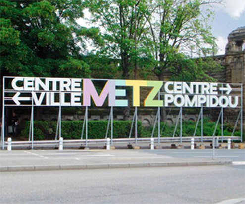
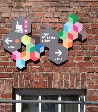
Therefore, the information needed to create the most effective sign would be to have an arrow in the general direction the landmark is, as well as the name. However, to graphically take it another step, even just using logos or symbols would simplify the sign even more and create an aesthetically pleasing look. Examples of signs that look pleasing and artistic to the eye similar to the concept I am trying to convey can be seen in these:
Therefore, the information needed to create the most effective sign would be to have an arrow in the general direction the landmark is, as well as the name. However, to graphically take it another step, even just using logos or symbols would simplify the sign even more and create an aesthetically pleasing look. Examples of signs that look pleasing and artistic to the eye similar to the concept I am trying to convey can be seen in these:
 |  |

 RSS Feed
